The future depends on what you do today.

360—degree
approach.
approach.
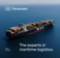
Transocean
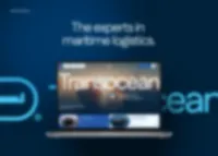
Maritime transpiration company.
Branding
Website Design
Motion Design
Scroll to Explore
/ Overview
We decided to choose the niche (ocean logistics) industry after a quick review of the websites of the biggest players, and we think they (companies) defenitely deserve better, like this concept.
/ Project details
Name: Transocean
Industry: Logistics / Transportation
Type: Concept
Scope: Branding, Website Design, Motion Design
Completed: November 2024


Behance Featured
Behance Featured
Behance Featured
Behance Featured
/ Social proof
Every project tells a story, and the numbers reveal how it resonates with the world. Explore key metrics from social platforms — views, likes, and comments — that showcase the reach, engagement, and impact of this project.
0
Views
Total number of views from each platform where we posted shots form this project together.
0
Likes
Total number of likes from each platform where we posted shots form this project
0
Comments
Total number of comments from each platform where we posted shots form this project toget

/ Project assumptions
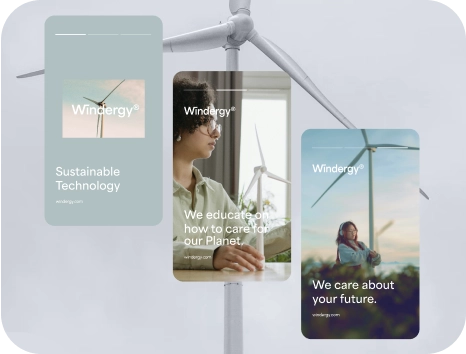
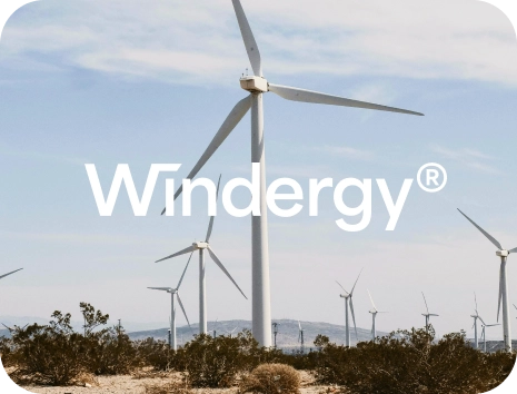
The right assumptions, aim to create a design that is both visually appealing and functional, tailored to an audience interested in sustainable energy solutions.
/ Details
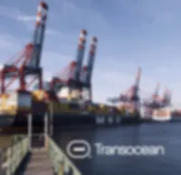
Focus on Logistics Maritime Feeling
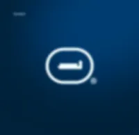
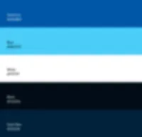
The name "Transocean" suggests a connection between transport/logistics and ocean or sea to reflect a maritime approach of the company. Additionally, blue shades colors emphasize the sea-driven of the brand.
Minimalist Interface
The design likely emphasizes clean lines, intuitive navigation, and minimal clutter to make interactions simple and user-friendly.
Interactive Components
The concept includes interactive elements such as sliders or toggles, and background video to increase the appeal of the website.
/ Project scope
Our main goal was to design the branding, the hero section of the website for mobile and desktop devices, but also, present the dashboard of customer panel.
/ Details
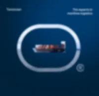
Branding
The name "Transocean" suggests a connection between transport/logistics and ocean or sea to reflect a maritime approach of the company. Additionally, blue shades colors emphasize the sea-driven of the brand. The logo is simple and clean and the symbol reffers to cargo-ship.
Website
Our goal was to design a clean and minimalistic hero website, but without overwhelming, with a captivating video in the background and intro animation, to keep the business level feeling.
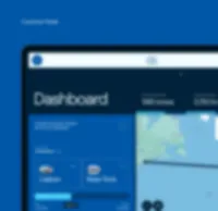
Customer Panel
Clean and minimalist, displaying only the most important information, such as the current transport status of the order on the map and the overall order statistics of a specific customer. In addition, everything is wrapped in
a simple and smooth animation.
/ Project feedback
The true measure of success lies in the voices of those who experience it firsthand. Below, you’ll find a curated selection of feedback from users, industry professionals, and community members across various platforms.

Next Case Study
Next Case Study
Next Case Study
Next Case Study
Let's collaborate

/ Contact
Say hello 👋
Don't hesitate to ping us if you have any questions
or a willing to contact us in any matter other than
project collaboration.
or a willing to contact us in any matter other than
project collaboration.
Sent successfully
We will reply to your inquiry in 24 hours.
Meanwhile, you can familiarize yourself with our current pricing document - which you should get automatically at your email- to know about us, and learn more about potential costs.
Meanwhile, you can familiarize yourself with our current pricing document - which you should get automatically at your email- to know about us, and learn more about potential costs.
